Ember accessibility and a11y tools
What is it like to build an accessible Ember app? With a few lines of code, you can audit your app for problems, get customized advice on how to fix them, and see visual indications of which things on a page need work. We'll walk through an example using the Super Rentals app from Ember's official tutorials. We'll also cover some improvements being made to Ember itself for a better experience out of the box.
An accessible app is one that gives all users equal access to information and functionality, including those who use Assistive Technology like screen readers. This kind of work is sometimes abbreviated as a11y. There are set standards called the Web Content Accessibility Guidelines, and in many cases, it's the law.
This article was written as of Ember.js version 3.1. The same approach applies for all 2.x apps, with some changes to test syntax. Anyone can write a guest article --- get in touch if you are interested!
Using ember-a11y-testing
We don't have to learn a thousand rules to start building accessible apps. There are amazing community contributors who are working hard to make it as easy as possible to follow web best practices, and they created a set of tools referred to as ember-a11y.
ember-a11y-testing is an addon that reveals actionable improvements to your app's accessibility and guides us through making the changes.
Let's start by cloning an example app to try the tools on:
git clone git@github.com:ember-learn/super-rentals.git
cd super-rentals
yarn # or npm install
Next, install ember-a11y-testing and start the app:
ember install ember-a11y-testing
ember server
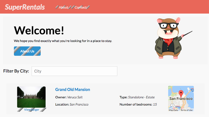
After installing ember-a11y-testing, it gets to work right away! Navigate to http://localhost:4200 and take a look.

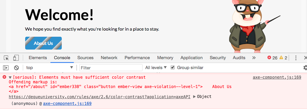
See these weird stripes? Those are an indication that we have some problems with the elements. Due to color choices and text size, the content might be hard for some people to read. The list of issues show up as a console error in this view too. But how do we fix them?

The link in the console error message brings us to this color contrast checker, where we can play around with font sizes, font colors, and backgrounds until the view meets the standards.
In this way, learning the rules and standards of accessibility can be incremental. It's like having an accessibility expert inside the app. Once you have a handle on most of the issues, you can use some configuration settings to toggle the check on and off so that your development server build times are faster.
Add accessibility checks during Rendering tests
Rendering tests are a way to simulate user behavior, like clicking around and filling in forms. The ember-a11y-testing helpers can be added right in with your existing test suite. This test navigates to the index of the project and checks for any issues:
import a11yAudit from 'ember-a11y-testing/test-support/audit';
// ... normal test boilerplate ...
test('accessibility check', async function (assert) {
  await visit('/');
  await a11yAudit();
  assert.ok(true, 'no a11y errors found!');
});
It's important to incorporate the check into the test suite, because in larger apps, it's nearly impossible to know how adjusting the value of a CSS color variable will affect every single UI state. It's better to have programmatic checks to prevent things from slipping through the cracks. Combined with Continuous Integration (CI) pipelines, we can make accessibility a requirement to merge, without us needing to personally implore coworkers to follow the standards.
Run the test suite
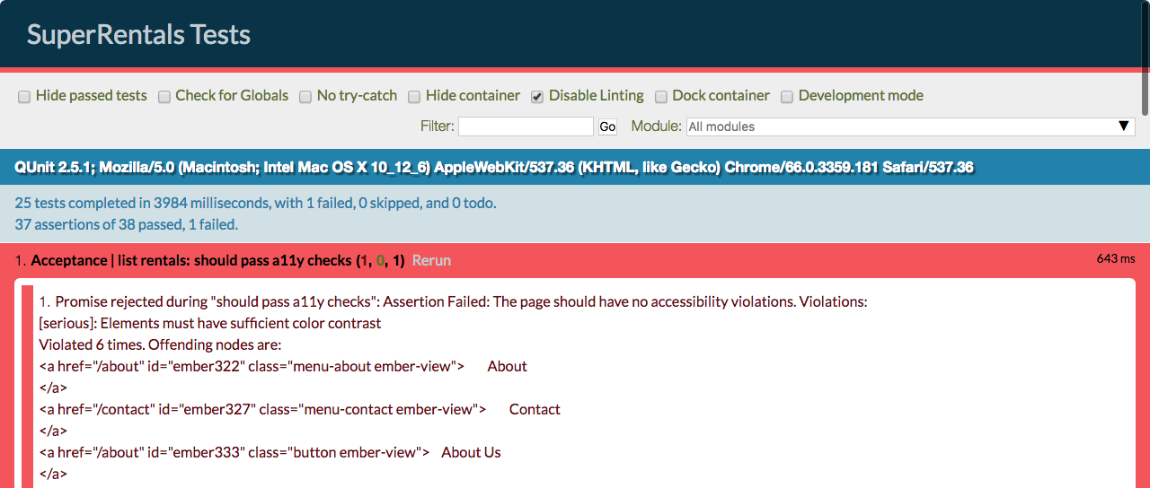
Start up your app with ember serve and then navigate to http://localhost:4200/tests to see the browser-based test runner. Sure enough, we see some problems! Like we saw in the console earlier, there are specific error messages and links to resources that help us to fix the problems.

This is awesome because we don't need to become an expert on form accessibility to get started down the right track.
Fix the critical problems identified in the tests
Since the errors have ratings, we know to start with the critical error, which is that a form has missing labels. Screen readers rely on labels, not placeholder text, to help users navigate forms. Also, it's better UX for everyone.
Here's what the form looks like before changes:
{{input id="filterByCity" value=value key-up=(action 'handleFilterEntry') class="light" placeholder="Filter By City"}}
Let's add the label. The for attribute should match the input id.
<label for="filterByCity" class="screen-reader">
    Filter By City
</label>

{{input id="filterByCity" value=value key-up=(action 'handleFilterEntry') class="light" placeholder="Filter By City"}}
Now the filter has a label, and the tests pass!
Fixing issues with contrast, aria labels, and DOM elements is an important step towards building an accessible app. That said, there are some tools that help reduce the amount of work that you have to do by hand, and we'll cover those next.
Using ember-a11y-landmarks for roles
Here's one example of an addon that helps reduce the number of changes to make by hand. The ember-a11y-landmarks addon helps manage the roles that should go on semantic tags like <header> and <nav>, without needing to learn the intricacies of when to use them.
One huge thing you can do to improve an app's accessibility is to use semantic tags in the HTML. For example, always use <button> for buttons, instead of making them divs. However, some semantic tags still need extra attributes called roles for screen readers to work right, and they only need them some of the time based on their position in the DOM. ember-a11y-landmarks to the rescue!
To use this addon, wrap content in the ally-landmark block and say what kind of tag to use. Here's a template example:
{{#a11y-landmark tagName="footer"}}
   This is a footer!
{{/a11y-landmark}}
And here's the html output with the correct role assigned:
<footer id="ember337" role="contentinfo" class="ember-view">
  This is a footer!
</footer>
There's also some good news! Some of the use cases for this addon are addressed by new options available in Ember itself!
Structural application concerns
Now that we've covered how to fix individual app problems like color contrast, let's talk about what needs to be done to help fix issues that affect all Ember apps.
With the release of 3.1, Ember.js introduced some new features within the framework itself, and community addons continue to help drive progress on the remaining concerns. Historically, many new features in Ember originated as community addons.
There's a lot of progress being made in Ember itself, our community addons, and by our pals working in other frameworks! You can learn more in the recent JavaScript State of Accessibility panel hosted by ThisDot Media. Jump to the Ember segment presented by Melanie Sumner here.
New options for out-of-the-box accessibility
One common issue in single page application frameworks is that they wrap a developer's content in extra divs. However, some elements like <header> should be direct descendants of the body element. RFC 280 proposed an option for removing the application-level div wrapper (an RFC, or Request for Comments, is the main way that new features are proposed and opened for community feedback). That RFC was accepted, meaning that work could begin to add the feature into Ember, and the new option shipped in version 3.1. You can learn more about it and how to enable the feature in the release blog post.
Using the ember-a11y addon for focus management
I learned from Robert DeLuca that most front end frameworks have flaws that affect Assistive Technology like screen readers. One of those flaws is focus management, and there's already an addon for it.
While ember-a11y refers to a whole bunch of tools, there's one addon called ember-a11y. The main task of this addon is to handle focus correctly so that users with Assistive Technology can navigate content as changes happen inside the {{outlet}} of a route.
ember install ember-a11yInstall it and replace instances of {{outlet}} with
{{focusing-outlet}}.
So why is this necessary? If you're looking at a decently accessible website and you hit the tab key, you'll see the focus jump between different elements - things get highlighted. Front end frameworks like Ember sometimes get in the way of the DOM structure that works best for screen reader focus, since as you move between routes, only part of the page changes. The contents of {{outlet}} are dynamic.
The problem is that screen readers rely heavily on what has focus. Imagine if you had to start reading at the very top of the page whenever a route in your app changed, instead of reading the content that is new, or if you weren't able to tell that some content had changed! ember-a11y corrects for that focus problem so that Assistive Technology navigation using focus works correctly. From the README:
The current implementation of this addon will immediately apply focus to the most relevant piece of content based on actions users take (clicking buttons, links, etc). This allows screen readers to catch changes and read the right information, thus providing a much better experience for screen reader users.
What next?
It's our responsibility as developers to build inclusive tech, so keep learning and building! Melanie Sumner's EmberConf talk Accessibility for All is a fast, concise introduction to accessibility in Ember, and this article series provides a deeper dive.
There are already many community addons available that solve different issues. While we still have a ways to go, new advances are being made too. For example, there is a Semantic Test Selectors RFC being drafted and an experimental addon in development to go with it! These efforts followed Jamie White's talk from EmberConf, Say More.
Almost all of us will have a disability at some point in our lives. Accessible web practices lead to better user experience --- things like improved keyboard navigation, text that is still readable on a dim monitor, and clear pointers on how to interact with a UI.
Here are some ways you can help improve accessibility in Ember and the JavaScript ecosystem:
- Research and try out other ember-a11y tools
- Make your own apps accessible, and let the world know about it! You can use #emberjs and #a11y to spread the word on Twitter, for example
- Include a11y considerations in your talks and articles
- Contribute to addons that help solve these problems
- Guide your coworkers and collaborators through the learning process
- Avoid language that perpetuates the idea that accessibility is too hard. Focus on the tools that make it easier and our responsibilities as developers.
- Support and comment on RFCs that help make Ember more accessible out of the box
Accessible apps are better for everyone.
Thanks
Our community's improvements are the result of the hard work of many people! Shared solutions take more time to develop, but we can all move forward together.
Many thanks to everyone who raises the profile of accessibility in Ember, the team behind a11y addons, contributors involved in getting some features into Ember itself, and those who encourage others to adopt accessible practices. Extra thanks to Sean Massa, Melanie Sumner, Jamie White, and Robert DeLuca for reviewing this post.